• Office Hours: 9:00am-6:00pm EST

Author Archives: identicom

6 Simple Ways to Stand Out Above the Rest.

When it comes to your storefront, you want to stick out – in a good way. Designing your storefront sign is something you probably worry over being it is the face of your business. Here are some easy pointers to help assist you on creating your sign.

#1. Keep it Simple.

Simple is better. Avoid being too detailed. Keep your sign clean and crisp so the message gets sent thoroughly.  If your sign looks “too busy” it can create confusion on what your store offers and drive away potential customers. Get a second pair of eyes to help you. A design professional who understands what it is you are looking for can help you simplify things and still achieve the look and feel that you want to convey to your audience.
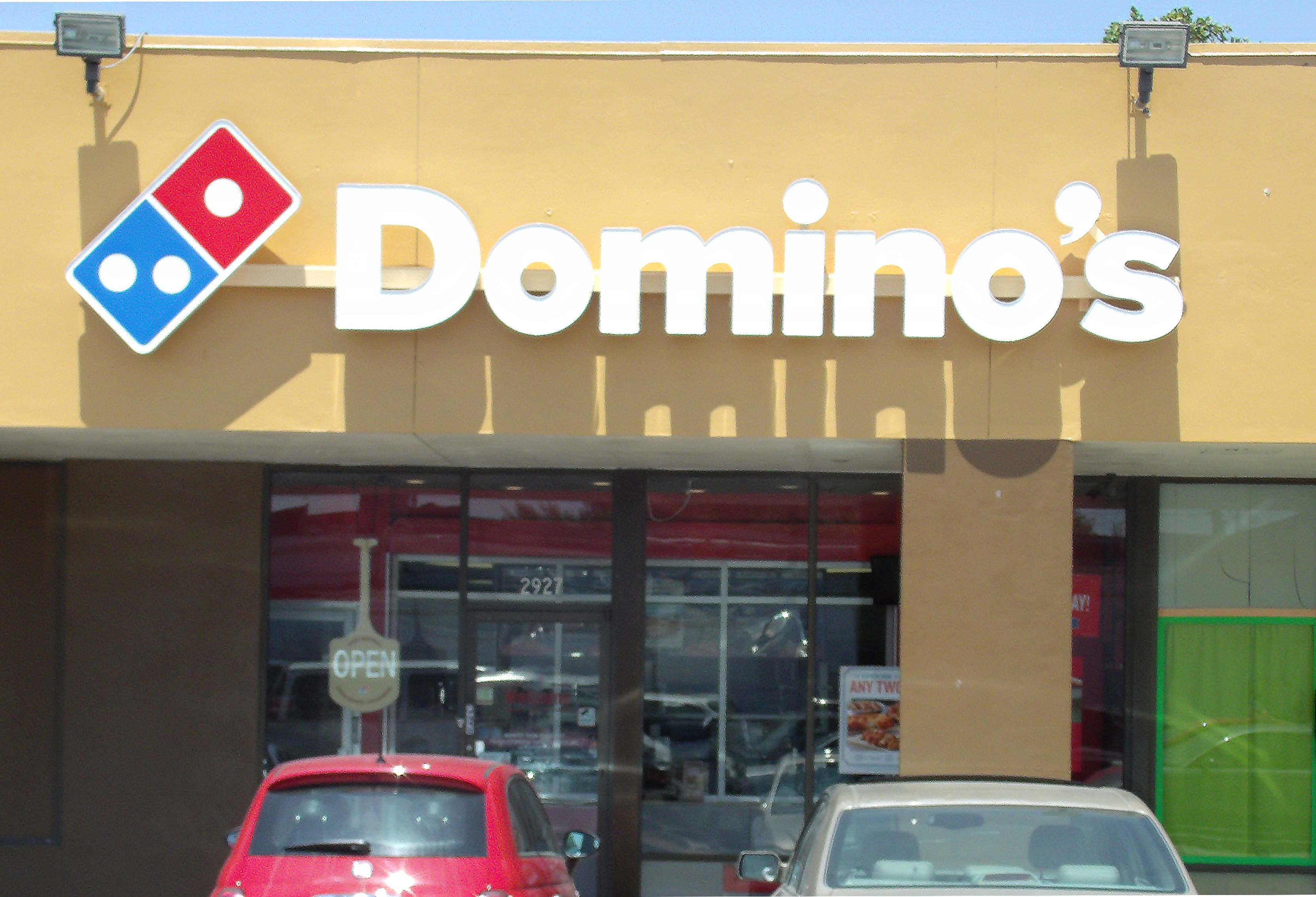
18ixos3ucv3xmjpg

#2. Color Choice.

Your sign should reflect your brand identity & the color should reflect that. Keep in mind, that your sign may need to be modified based on City rules & guidelines. Make sure your color looks good against the building that you are in. Think about season changes, weather conditions and how this color will look through the different weather conditions and daylight hours.

eclectic-home-decor

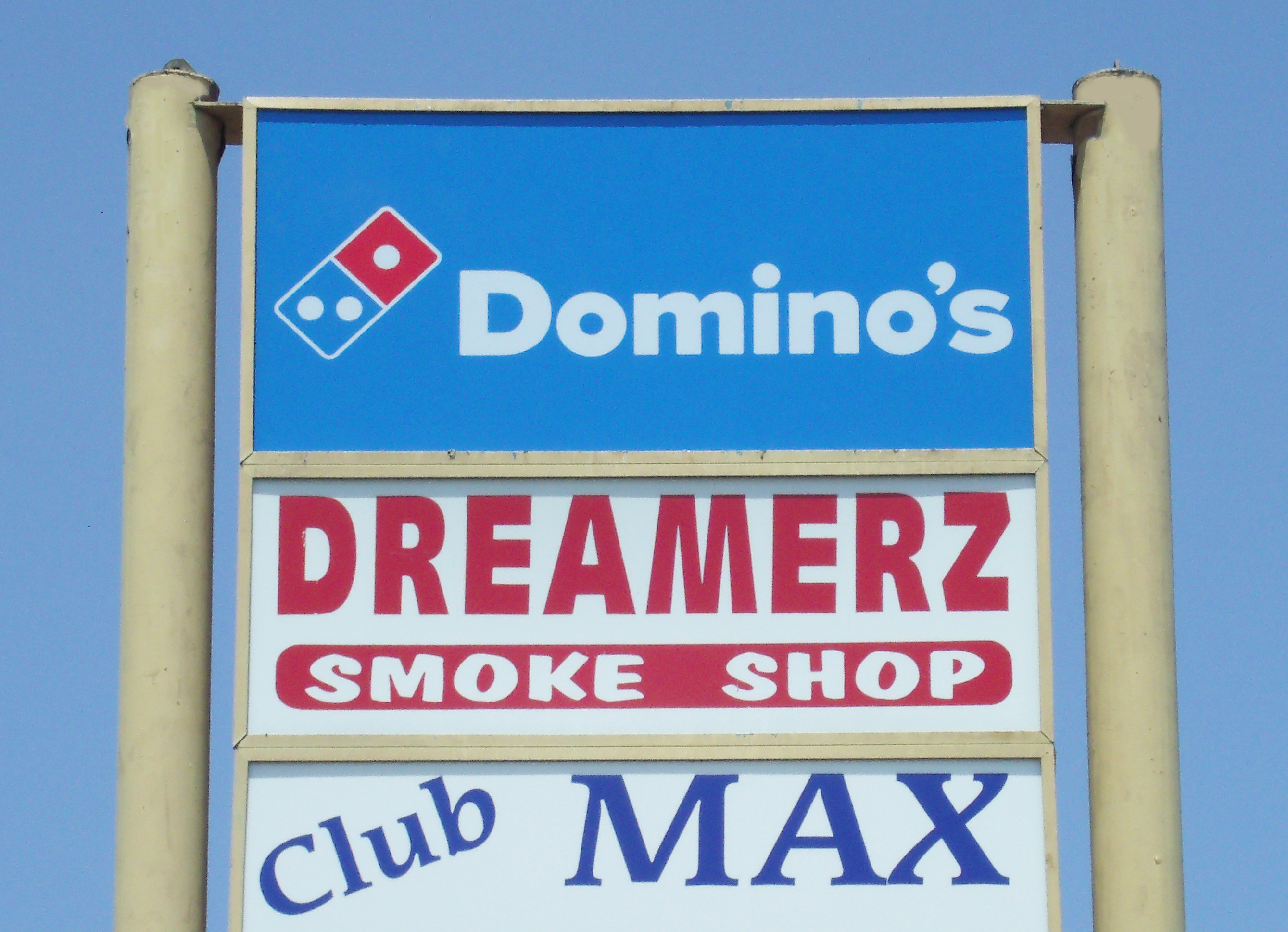
#3 Check Your Neighbors.

Look around the area where your storefront is located & who your neighbors are. What type of signs do you see around you?  Consider this in the process of your design. Pay attention to signs that people seem to be gravitating to in your area. Take note of the color themes, look & style of your neighbors sign. You want to stand out, but in a good way. Think about how you can execute this by considering color & style choices.

 $_35

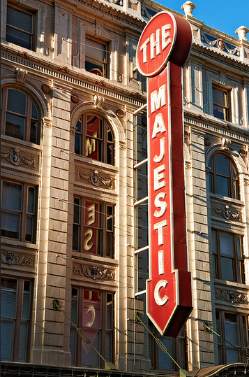
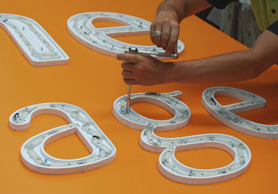
#4 Lighten Things Up.

If your storefront permits lighting options for your sign, then go for it. Lighting helps customers see your sign during various weather conditions & during the evening hours. There are several options for different ways you can illuminate your sign to stand out against other competitors.

201381914815513

#5. Readability & Font Style

Choosing the right font, typeface & style of your sign is an important detail that needs to be carefully thought out. A font style may look great on paper, but when put into a 3-D element, it may have an entirely different look & feel to your design. A professional can be a great asset to this process by being knowledgable in what fonts work best and will work in accordance to your company’s identity.

Screen Shot 2015-09-16 at 1.33.18 PM

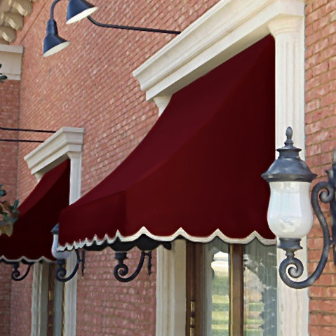
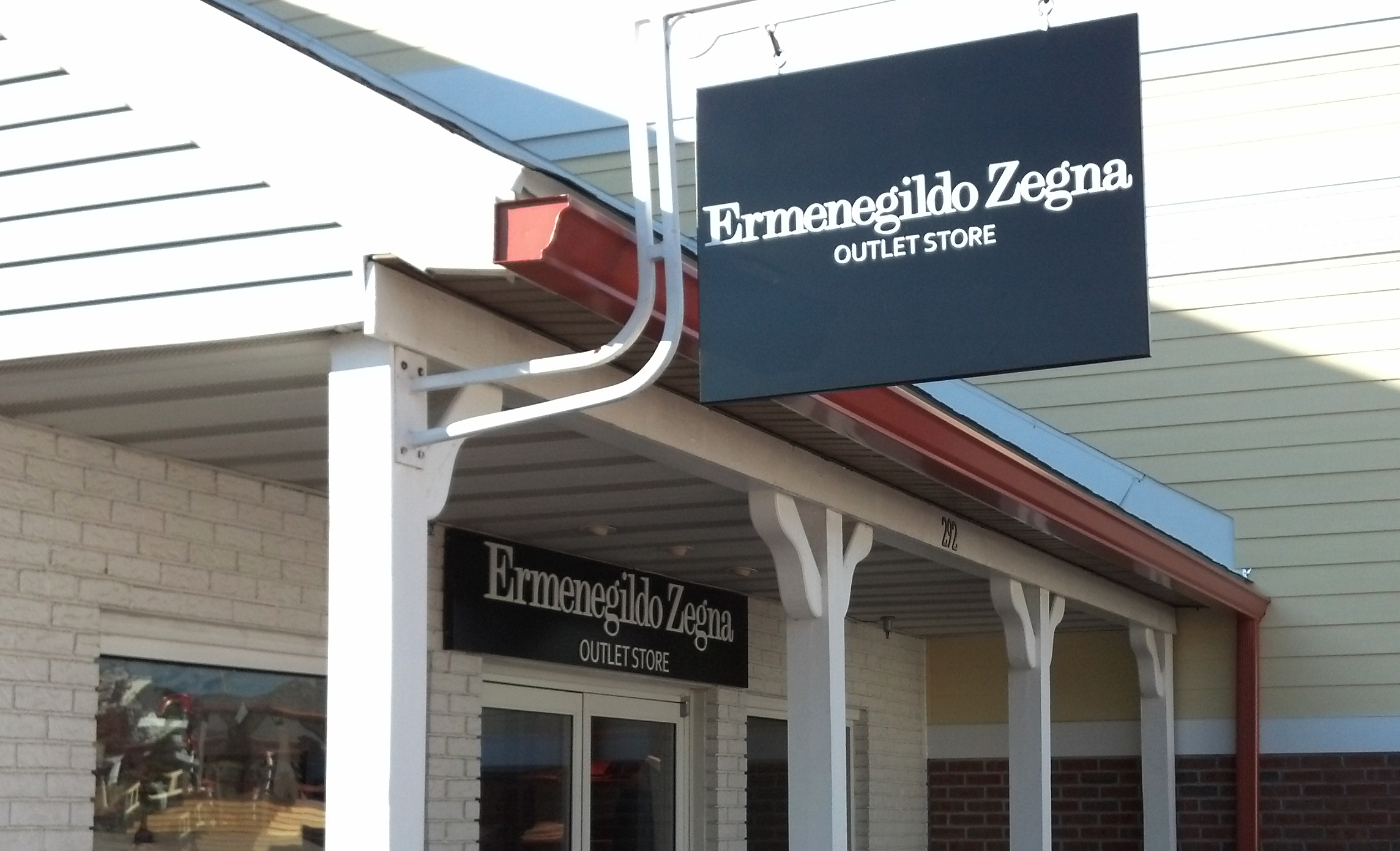
#6. Accessorize. Awnings. 

Awnings are a nice accessory to your storefront. It creates shade to the interior of your store keeping the sunlight from glaring in and cools things down. Awnings also look nice. They give an added feature to the front of your store and can also offer shelter on a rainy day drawing potential customers to come in.

The Importance of a First Impression – Signs.

Let’s imagine you are on a road trip coming back from vacation and you are hungry. You are in an unknown area and your stomach is grumbling. What is the first thing you do? I know what I do, I look for a sign. I look to see what City I am in and I Google search for “Restaurants near me.” I look for street signs with logos of restaurants indicating how many miles until there is an exit for food. Once I find where my stomach wants to lead me, I look for another sign. “Big Boy’s Restaurant” a glowing Illuminated pylon sign, standing tall in the air staring down at me and then I see a giant big boy holding a plate full of burger goodness.  I whiz off the highway drooling like a raging hungry wolf and veer onto the next exit. The sign gets closer in view and finally, I have arrived. Park it. Time to dig in.

Big Boys, Marysville 002

Based on studies & statistics developed by The New York State Small Business  Development Center –

46% of people who are driven to your business, were driven there by your sign. 

35% knew of your business because they saw it while passing by.

Signs are a silent sales representative of your business. Exterior signs draw attention to your business, establish brand identity and can assist customers in navigation.

First Impressions Count. The design, look & feel of your sign in imperative to representing your company.

Maintenance is also an important part of the representation of your sign. If a bulb burns out, or colors fade on your sign – This can create a lack of appeal to outside potential customers.

More than any other form of advertisement, your sign has the best return on investment.

Did you know? 

•  That more than 35% of your customers likely saw your company from driving by?

• That more than 46% of your customers were drawn to your business because of your sign?

• On average, one additional on-premise sign resulted in an increase in annual sales revenue of 4.75%.

• When new signage was added on a previously unsigned side of a business – the company sales increased from 2.5% to 7.1%

These Studies were referred from a handbook developed by

The New York State Small Business Development Center

Blade signs defined & how they can benefit for your business.

Definition:

A blade sign is a type of projecting sign mounted on a building facade or storefront pole or attached to a surface perpendicular to the normal flow of traffic. These signs are one of the most effective way of attracting foot traffic into your establishment.

theory_Melrose_LA-1

Identicom Signs Installed this Theory Blade Sign – Located in Los Angeles, CA

Why a Blade Sign may be beneficial for your company:

• Blade Signs operate in a similar function as a “way-finding” sign. The  sign sticks perpendicularly out from the building – pulling the eye to look at it for navigation. This is beneficial for street traffic to see that your business stands out from the rest luring customers to come inside and see what’s “in store.”

• Blade signs are particularly popular in downtown shopping areas where there is a lot of foot and street traffic.  Blade signs can be designed in various ways, shapes & sizes. Blade signs are typically double sided, and stay consistent with the stores brand identity, look & feel.

• The history of blade signs stems back all the way to the fourteenth century – Blade signs became more elaborate in the 1930s all the way through to the 1960s and have become a cherished vintage part of some older buildings. In Charlottesville,VA – They are devoting the time and efforts to raise money for the known Paramount blade sign located downtown. You can help contribute to raising money for this fund raiser below.

The Paramount’s Historic Blade Sign

https://www.indiegogo.com/projects/the-paramount-s-historic-blade-sign#/story

Zegna Woodbury, NY blade sign

IdentiCom Signs Installed this Ermenegildo Zegna Outlet Store sign located in Woodbury, NY

Here are some historical Blade signs from the 1930s

OLYMPUS DIGITAL CAMERA
Nathans built in the 1930s – Located in NYC, NY

Screen Shot 2015-09-02 at 12.45.13 PM

The Majestic – Located in Dallas, TX Built in 1925

sbobet88

slot kamboja

slot bet 100

nexus slot

Power of Ninja

Power of Ninja

Mental Slot

Mental Slot

https://zimbiosciences.com/

https://suchanaboard.com/wp-includes/spaceman-slot/

https://semuaunggul.com/wp-includes/spaceman-slot/

https://truenaturenutrition.com/wp-includes/slot-spaceman/

https://thess-xromata-sidirika.gr/wp-includes/slot-spaceman/

https://pakistanfarm.com/wp-includes/spaceman-slot/

https://radiante.website/wp-includes/spaceman-slot/

https://zouqechaam.com/wp-includes/spaceman-slot/

https://linfecolombo.com/wp-includes/spaceman/

https://semuaunggul.com/wp-includes/judi-bola/

sbobet

sbobet