
Rule of Thumb – All things point to a good sign.
Okay, so you are about to open up shop and you couldn’t be more excited. A sign, you need a sign!
Maybe you have put a lot of thought into it already and maybe, not so much.
I can’t repeatedly tell you how important your sign is for your business…(Oh, wait- Yes, I can. ) 😉

Here are some “Rule of Thumb” tips for you!
Rule No. #1
– Assume EVERYONE is a VISITOR!

It’s important to keep on a fresh pair of eyes and an open mind when you are designing your sign.
Think about how your sign will look and feel to different ages, races and ethnic backgrounds. What do you want to convey with your sign? How does your sign stand out and what does it translate without reading the type? Try to embrace the idea that you want to attract everyone, even if your business is focused on a certain genre. The people who may not fit into your target audience could have a sister, mother or brother who is! So welcome them all. 🙂
Rule No. #2
Don’t be so negative and float away!

Don’t be so negative. No, seriously! Don’t be so negative! When it comes to signs, mainly cabinet signs it is important to know that there is a “rule of thumb” to only have 40% negative space with 60% copy space (type space) – You do not want your logo to be floating in a box…because whoa whoa whoa!!! Watch your business float away!!
Rule No.# 3
Keep things in perspective.
So, ask yourself these questions:
- How big is my building?
- Who is my audience? (walk-in traffic, drive-by…etc.)
- What do I want to say?
- How big should my sign be?
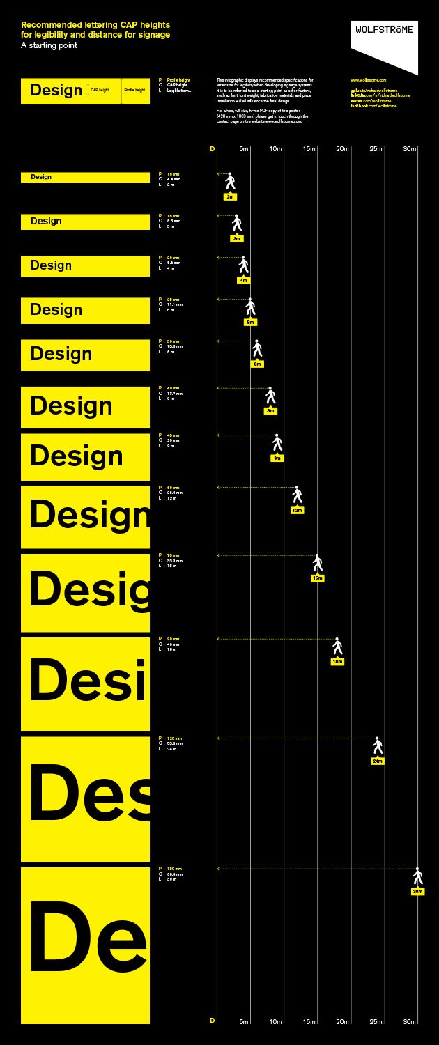
Number four is the BIG one to ask yourself. After you find out the criteria from the town/city of what your permit rights are, think about how big you want to be. From certain angles and distances – How are you going to look? The above photo provides you some insight on how things look to the human naked eye from certain distances.
Rule No. #4
Think outside the box but color inside the lines.
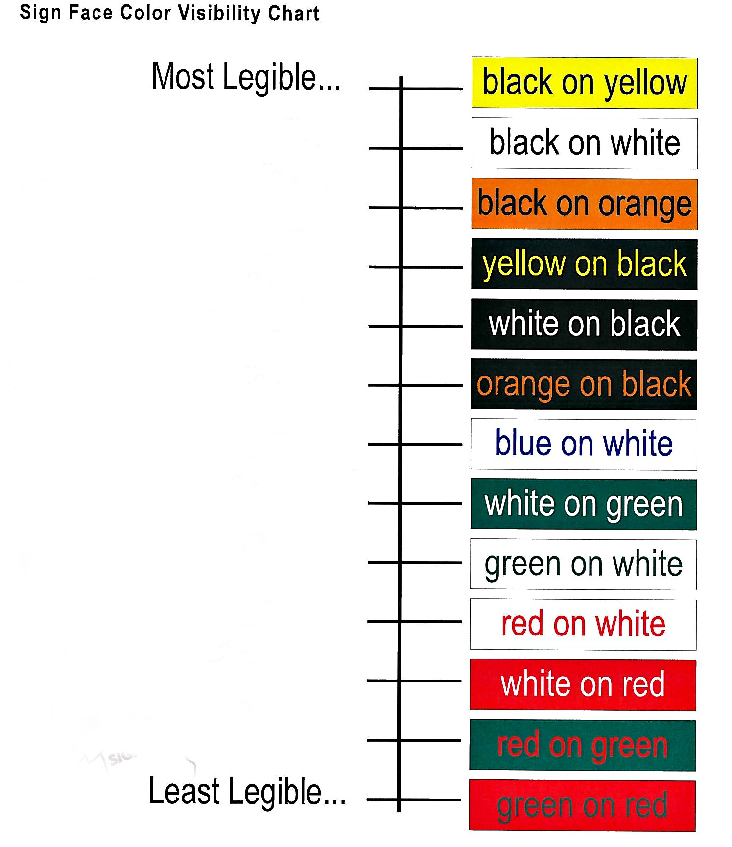
The image above gives you the run down on how your sign looks on different color choices and different choices of font colors. Remember this, when you are designing your sign you do not want to have your sign lost because of color.
Once upon a time, I took on a freelance design gig for a Jewelry company with a very stubborn older man who was infatuated with using Christmas colors of green and red – for his logo design. I love Saint Nick and all, but come on! Give the ol’ Nick a break and take it easy on your company logo. Green and red not only remind most of us of the holiday season, but it also is not so friendly on the eyes.
So there are my rules of thumb for the week! Happy Signing! 🙂