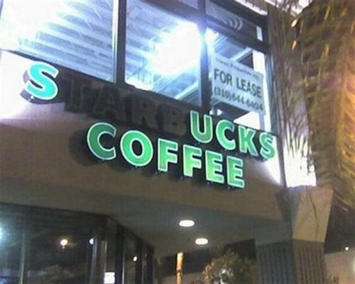
1.) Light Outages –
When you consider the name of your business and the sign you are going to create, consider what it will look like if 1,2 or 3 lights go out and change the words and slogan completely. This issue is common and can easily be resolved with reliable maintenance. That is why we offer services not just with installation but with annual services in maintenance and on call assistance when there is an issue with your sign such as light outages.
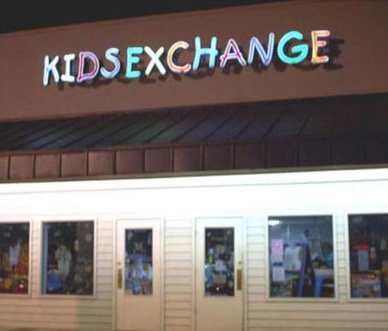
2) Keep a safe distance
Think about the name of your logo, the spacing of how you will design it and how it will look hanging up on display. This example of “Kids Exchange” Shows you how blending in 2 words can suddenly look like something completely appalling and cause your potential customers to not only run away from your business but be insulted of your lack of consideration.
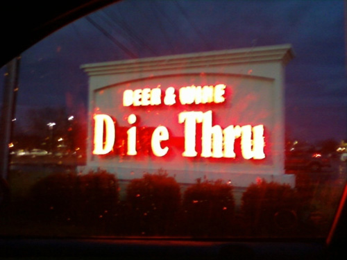
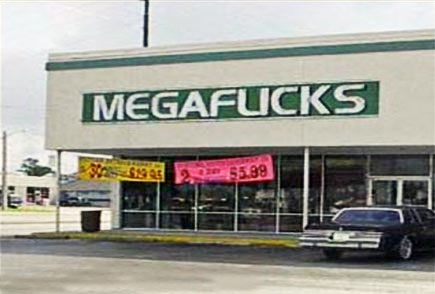
3) Think about your font choice.
Here is an example of a font causing a sign to look like two letters are actually one and create the sign to look like a curse word. Keep in mind that fonts sometimes change their look and feel when they are created into a 3 dimensional object like channel lettering. That is why its imperative to have a professional help you with your design even if you may have some solid experience in programs such as photoshop and illustrator.


